One of the biggest challenges of e-commerce marketing is getting traction. You have a beautifully designed site and mobile app, plenty of inventory, and an efficient system for shipping and tracking orders. All this effort goes nowhere if you can’t build brand awareness.
Building awareness is the earliest stage of the marketing funnel. It centers on helping people recognize and remember your company. Successful brand awareness helps potential customers recognize your products as unique, and it influences purchase decisions positively.
So how do you make an impression on an audience that wants and needs your products?
Social media is the place to start. E-commerce marketing thrives on social media. According to one study, 18.2% of all internet users in the U.S. have purchased products directly from social media. And the platforms where people are buying are growing at a rapid rate.
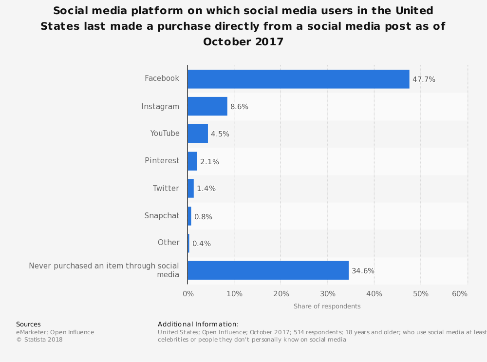
Facebook and Instagram ads are far and away the most popular paths to social purchases. If you want to get started with e-commerce ads, these two platforms are perfect for introducing your brand to the public. But these platforms are increasingly popular with marketers. You need a way to stand out. Video is the best way to catch users’ attention.
You don’t need a large content team to produce high-quality video marketing; you just need the right template. From our extensive template library, we’ve collected the top 10 videos for e-commerce marketing. Each template presents a different way to build brand awareness through video.
Read on to find the perfect video template for your digital store.
To express buyer aspirations
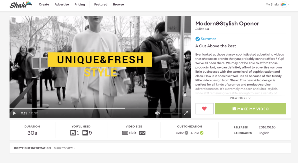
When introducing your brand, you don’t have to get too granular about the products you sell; you just need to stir up a little momentum. The Modern&Stylish template is a quick cut of fast-paced videos (black-and-white recommended) that create a series of stylish impressions.
This template will help viewers associate your brand with luxury and style. According to a large study of video ads, audiences tend to respond neutrally or positively to content based on their “aspirational self,” a.k.a. their expressed passions, hobbies, and pastimes. No matter the price point, people want to identify with content that speaks to an idealized version of themselves. When you align your products with those aspirations, you make your products more desirable.
The quick editing and black-and-white shading will create an aura of mystery that will compel viewers to want to learn more. That curiosity may lead them to your other social content or directly to your store, moving them directly down the marketing funnel.
To market several products at once
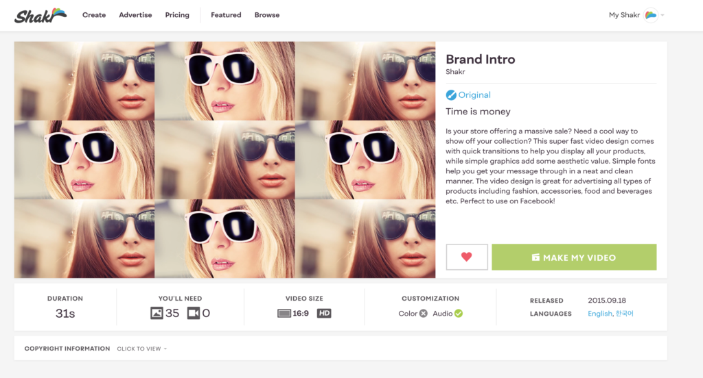
Psychologically, everybody loves the power of choice. When introduced to a spread of free samples, we want to try every flavor. But we are less likely to make decisions if the choices aren’t narrowed down a bit. The Brand Intro video template helps you show the variety in your e-commerce product line without totally overwhelming the viewer.
The template is a modified slideshow of 35(!) images that lasts a little over 30 seconds. The quick succession of images, coupled with colorful frames and fun animations, is like candy for the eye. A video like this may be more likely to capture attention than a slower-paced or less visually stimulating video.
Viewers see a ton of new content without wasting time, and you get to show off all of your shiny products, so everyone wins.
To help people remember your name
Text and video go together like a horse and carriage, peanut butter and jelly, etc. Text reinforces the messages shown and spoken in your video, making it easier for viewers to remember what they’ve seen.
Adding text also makes your video more watchable to audiences who have the sound turned off. A silent video works just as well for brand awareness as a video with a soundtrack or voice-over does. In fact, many social media users prefer silent video.
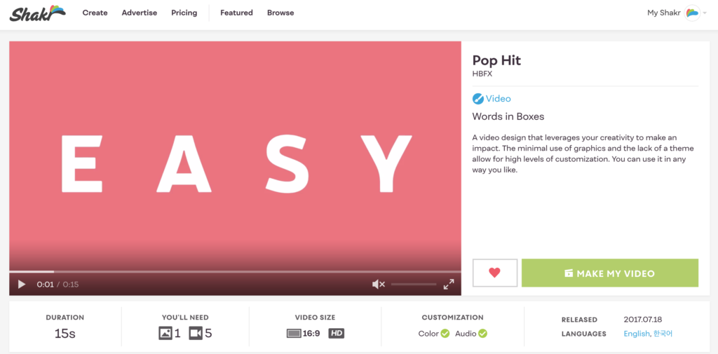
Pop Hit incorporates title cards and captions to add light text to a short, colorful template that’s perfect for introducing your company to the world. You can use the text to repeat your brand name, introduce your tagline, or simply name the types of products you sell. When you couple well-chosen words and phrases with the five video clips included, you can tell a story in just 15 seconds.
To jazz up your product photography
For an e-commerce shop to be successful, quality product photos are essential. The quality of your photos can give you a more trustworthy reputation and affect conversions positively.
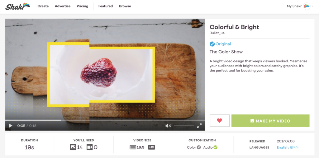
If you don’t have any video equipment, but you do have some great product photos, try the Colorful & Bright template for your first video ad. Dynamic slideshows are the perfect starting point for the true video-marketing beginner. The geometric graphics and unique animations, as well as the jazzy soundtrack, make static images come to life.
Graphics, animation, and other design features can completely change the tone of your video. In this template, the effects create a playful and upbeat tone that will leave viewers with an optimistic feeling and impression of your brand.
For a bright splash of color
Colors add variety to life. Different colors have a profound effect on our psyche, triggering emotions and influencing consumer behavior. For instance, green communicates trustworthiness, whereas blue can connote sadness.
Speaking of blue, don’t use it in your Facebook ads. According to our friends at AdEspresso, blue blends in too easily with Facebook’s design:
“[B]lue is a very hard color to use on Facebook as it doesn’t easily stand out. The whole platform is blue so anything of a similar hue will blend into the background. Making an ad fully blue will mean that people might miss it in the rest of the feed.”
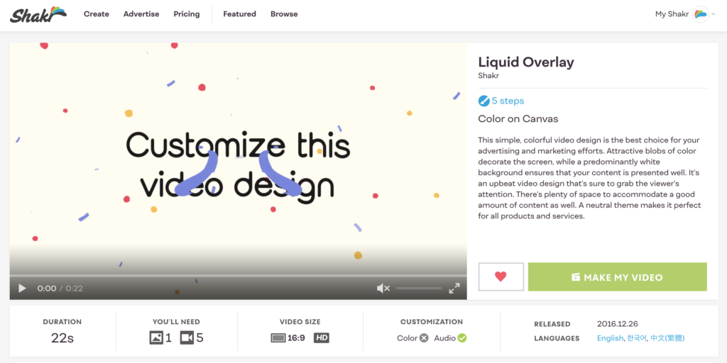
An unusual color is more likely to stop someone who is scrolling through their social feed. The template Liquid Overlay uses a burst of illustrated paint splashes to create a colorful display to entice viewers.
To speak to a specific persona
While pastel-colored palettes and cutesy illustrations work well for some customers, other customers respond to different designs. By segmenting your ad audiences into buyer personas, you can tailor the look and feel of your video ads to customer desires.
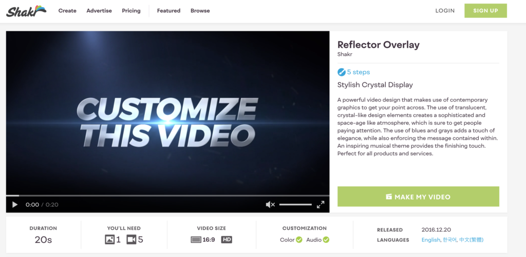
A buyer looking for professional products for their company, for instance, is seeking a competitive advantage. The Reflector Overlay template may speak to them. It is a simple, polished design composed of five video clips that are overlaid with silver and dark blue designs.
Its futuristic design will help you resonate with viewers who want the latest and greatest tech at their fingertips, now.
To appeal to nostalgia
If it isn’t already apparent from the zillions of BuzzFeed posts about the ’80s, ’90s, and early 2000s, nostalgia resonates with audiences. People love nostalgia because it feels good to relive positive memories from the past.
According to Forbes:
“In an age of impersonal digital media, building social connectedness through nostalgia is an easy way for companies to leverage the optimistic feelings that often accompany walks down memory lane. Associating brand messaging with positive references from the 90s, 80s — and even the 70s — humanizes brands, forging meaningful connections between the past and present.”
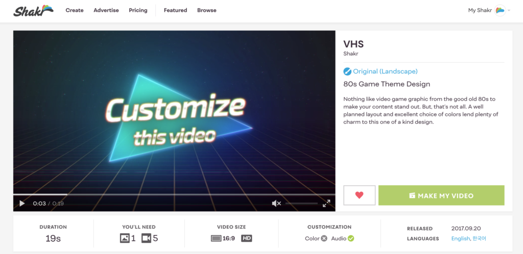
The VHS template is an ’80s throwback. Its clever graphics will endear new customers with a hit of nostalgia that they crave.
To humanize your brand
One of the best ways to both validate your product and humanize your brand is to feature real users. Customer testimonials build credibility with your audience by allowing your customers to do your marketing for you. Your audience will see themselves in the people you feature, making it easier to identify with your brand.
For example, a wedding-goods store with isolated shots of chairs, flowers, and bridesmaid dresses won’t convince people to buy. By instead turning the camera’s focus on couples, you can recreate the experience of celebration and love that moves people to have big weddings in the first place.
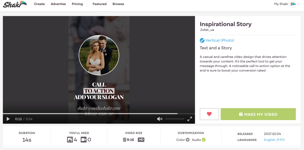
The Inspirational Story template is an incredibly easy template to work with. Take four user-submitted photos and tell your customer’s story in a short and beautiful clip.
For taking your B-roll to the next level
Small marketing videos can be just as great as any movie you watch at the cinema. This is largely due to B-roll footage of amazing products in action. Perhaps you have visually stunning location photography, extreme sports footage, or a shot of a vehicle in motion. Maybe you want to tell the story of your company’s origin or drum up excitement for a new product launch.
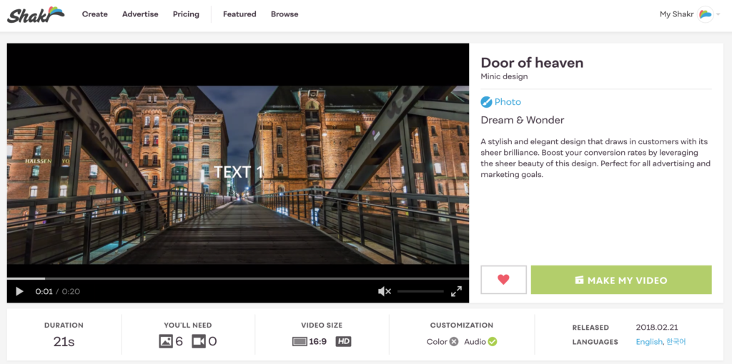
The Door of Heaven template can help you build a dramatic video arc with primary footage and B-roll. Choose the slideshow or video version, and then create a trailer-like clip filled with action, adventure, and anticipation.
For seasons’ greetings
Tying your marketing message to holidays, seasons, and other calendar events will make your message more relevant to viewers.
Holidays often trend on social media, so your content may be more likely to be featured either in search or in algorithm-based feeds. If people are already thinking about Christmas or Valentine’s Day, your ad will mesh more with customer interest at those times. Plus, holidays are occasions for gift giving, and viewers will be shopping for their loved ones.
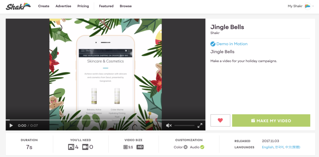
The Jingle Bells template has a fun, modern graphic around its border that creates seasonal flair while still spotlighting the product demo. Framing the action this way draws the eye to the center of the scene and conjures up jolly holiday cheer.
Taking your e-commerce marketing to the next level
Templates are not one-size-fits-all, but now you can take the inspiration from the examples above and run wild! Let these templates be the starting point for you to create the perfect ad or series of ads for your e-commerce business. The best part about using a template is how easy it is to take each video for a test drive, swap out content, and find the tone that fits you best.


