Hiring expert videographers and video editors is insanely expensive. This means that most small and medium-sized businesses are left to handle the video creation process on their own.
While we’ve shared plenty of tips on the Shakr blog about how to save money with the right tools, we haven’t talked a lot about how to actually design those professional-quality videos you need to elevate your brand. Now we will.
In this post, you’re going to learn the 6 subtle but crucial video design tips that the pros don’t want you to know. Using these tips, you’ll be able to create stunning, professional videos without any previous experience.
1. Don’t Just Play an Unedited Video Clip
This is a trap a lot of small businesses fall into. They reshoot a video clip over and over until it’s perfect, and then upload it exactly as-is. There’s no editing; even the two second pause at the end where the person on camera is standing there awkwardly makes it into the video.
Editing your video can do a lot, even if you’re just cutting out the awkward pauses. You can also add in title images, end screens, text overlays, captions, subtitles, and even special effects. You could use an app to turn a regular video clip into a time-lapse video (pictured above), and then add music to it with Shakr.
All of these are small touches that are surprisingly easy to incorporate, and take your video from “I shot this with a four year old iPhone” to reputation building.
2. Carefully Choose a Color Palette
This can be difficult to do if you don’t have a natural eye for it; I definitely don’t. Ideally, your videos should stick to a single color palette. This color palette should coordinate well with your logo and any branding content you’ll place on the video.
The coordination of a color palette can help your video to look crisp and clean. It also helps you choose the right text colors to ensure that they have enough contrast on the background to stand out.

These color palettes will come most heavily into play with screens of text or text overlays, but you should consider how they go with the actual video itself.
Pastels, for example, are gentle and soft. They’ll work well for businesses like a chocolatiers’s small business, or a design company trying to appeal to women (like Lauren Conrad’s content, pictured below).
Cold colors are demanding and attention grabbing, but the simplicity of monochrome-styled schemes often work best for most B2B businesses. They look simple, clean, and professional.
Need some color palette inspiration? Check out this amazing post from Canva.
3. Keep the Colors Simple
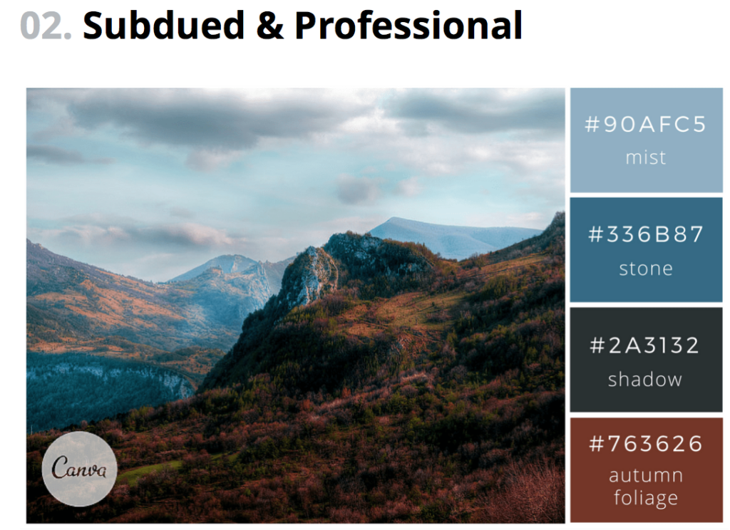
You’ve chosen your color palette, but you still want to limit the number of colors you actually use in your videos. You don’t need to use every single color in Canva’s recommended color palette if you don’t really need it.
Choosing more subdued colors for large spaces, like background or text overlays, will typically work to your advanced instead of bold bright colors. Bright colors can look heavy-handed and overwhelming depending on their use, so be careful with these. In the example color palette below (also from Canva), you’d want to use one of the top two colors as a background color instead of the bottom two.

The exception here would be for high quality background images, especially for title images; in this case, bright colors can be fine. Just make sure that the background isn’t overwhelming any content. The home screen example from a Mashable video is fantastic of how to strike that balance:

4. Use Easy-to-Read Text
We’re not even talking about the Webdings fonts here; fonts as abstract loopy cursives can make your video more difficult to view, and they’ll look less professional as a result. Choose clear, block texts that contrast well with the background image for optimal legibility.
Ideally, your text should also be formatted to fit the video screen in a way that’s aesthetically pleasing to the eye. This might mean centering the text, or moving it to a different position on the screen. In some cases, it will mean breaking up the text into several lines, even if you can fit it on one. A video that does all these things well can be seen below, thanks to Cuisinart:
5. Use Textual Cues
As you may have picked up from the above section, adding a few quick lines of text can make your videos look more professionally edited. Adding text just takes a few seconds (especially when using Shakr’s templates), but it can make a big difference.
You can use text to accomplish a number of different things, like introducing people on screen, establishing the context of the video to tell users why they need to care right away, and even break up the video into a stronger organizational format. And, as always, you can use it to create a powerful CTA at the end of your videos.
To add text to your video, you can use text overlay apps, or any number of Shakr’s video templates.
6. Create Your Own Thumbnail Before Uploading
You know how when you pause your TV, the person on it never, ever looks good? That stunning actress has her face twisted, her mouth hanging open, and is somehow hunched over. The last thing you want is to have that pause effect wreaking havoc on your video’s thumbnails. If your video thumbnail doesn’t look professional, the rest of your video will be judged harshly from the get-go.

The automatic thumbnails most sites generate themselves are all typically awful. Make sure that your video looks professional from the very beginning with a specially-created thumbnail. Many sites, including Facebook and YouTube, let you upload choose your own thumbnail.
Ideally, your thumbnail should be a clear, high-quality still image that demonstrates what the video will be about. You can use text to help with this. An excellent thumbnail example (which was custom-uploaded) is pictured below:

Shakr makes this easy for you, with all title cards in our video templates making the perfect instant video thumbnail. If you want to create your own, though, you can see some great tips on how to do so here.
Final Thoughts
If you want to get the most results from your video marketing campaigns, you want to ensure that you’re producing the most high quality videos possible. These design tips will help you elevate the aesthetics of your video content, getting stronger results in a quicker time frame. Whether you’re posting your ads onto your Facebook timeline or running Instagram video ads, keep these video design tips in mind and watch the conversions come rolling in.
Ready to use Shakr to give your video marketing a boost? Sign up for your free trial here.


