The best video ads in your social feeds are the ones that hold your attention, are relevant to your interests, and don’t annoy you.
For instance, say your favorite musical artist is coming to town, and you see a Facebook or Instagram video ad announcing the upcoming tour.

That’s awesome! Not only does the ad look and sound good on mobile, but it’s pretty effective for selling tickets.
You know a good video ad when you see one, but the formula for getting to that end point and creating a successful ad is not so clear. Even if you’ve found a receptive audience, you can still go wrong with the look and feel of your video and lose conversions in the end.
Fortunately, we’ve been around the block a few times when it comes to designing video content for Facebook and Instagram feeds. And now we’ve gathered all of the best practices in one place, so you don’t have to learn the hard way.
Keep it short
One popular principle in the design world is to “Keep it simple, stupid.” This means your design should never get in the user’s way. Same goes for your video ads. In order to make your marketing message clear from the get-go, your video ads should be as short as possible.
This ad from Credit Karma is a perfect example:
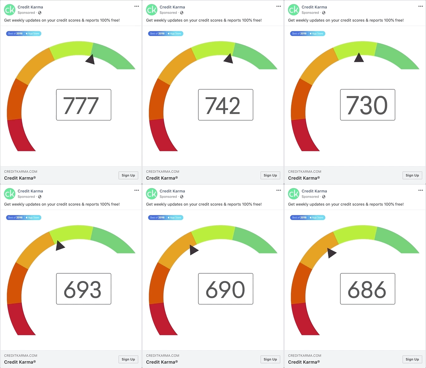
The bright colors and movement of the dial make this quick video ad eye-catching. The ad also instantly communicates what the product does. From the numbers and brand name, it’s easy to understand that you can use their services for help with your credit score.
Facebook and Instagram feeds are noisy, competitive locations for ad content. Short videos work best for an audience that’s easily distracted. If you can pair your main message with eye-popping design in the first 10 seconds, your ad will have the best chance of success.
Be strategic with sound
Sound in video ads is a controversial topic. You don’t want to disturb people who may be scrolling social media in public or in a quiet space. But music can make your marketing message more emotionally powerful. In the end, it’s better to be safe than sorry. Make all of your video ads sound-optional. Or as we’ve said in the past, design for sound off, delight with sound on.
Just look at this Macy’s holiday ad:
If you don’t have the sound on, you can see from the images and captions what the feel-good message is about. But when you turn on the voice-over, the ad feels far more personal and sweet. So don’t discount sound. Just have a backup plan for your background music.
Use channel-specific aspect ratios
When we first discussed video sizing for mobile, we pointed to this statistic:
On mobile screens held vertically, square videos in a 1:1 aspect ratio get 78% more screen space than landscape ones.
In the news feed, a video in traditional 16:9 aspect ratio will more likely be skipped or ignored simply because it’s less visible.
For a Facebook video ad shown in the news feed, the maximum aspect ratio is 2:3. This will offer you the most real estate for your marketing message. For an Instagram video ad shown in the timeline, the maximum aspect ratio is 4:5. If you want to use the exact same video for both, a good rule of thumb is to use square videos in 1:1.
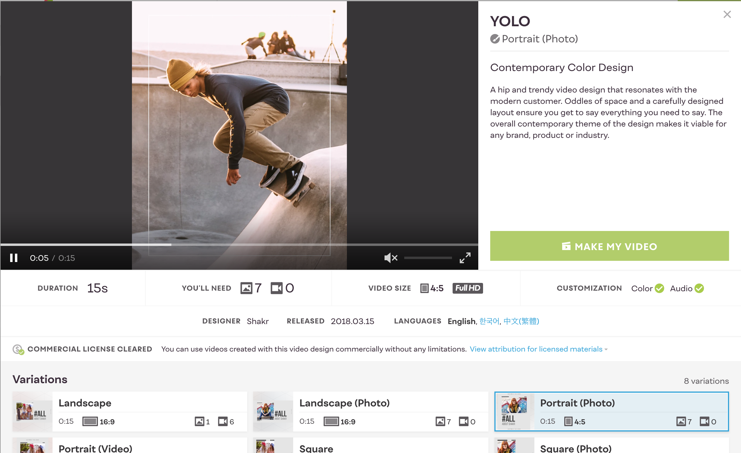
But if you want an easy way to optimize aspect ratios, try using a Shakr template. There are several designs that can be adapted to channel-specific ratios. For example, the YOLO video template gives you the option of creating square, portrait, landscape, and vertical videos.
Create a carousel
What’s better than one short video? Several. Carousels are a great vehicle for engagement because they stop viewers from scrolling vertically and get them to swipe horizontally.
You can use a carousel for creative storytelling or just to cover a variety of use cases for your product. Keep in mind that the first video should be the most eye-catching and include the most important copy. Just in case.
OLLY wants its audience to know that the company’s vitamins can take care of all that ails them. Their carousel of color-coordinated video ads shows the variety of problems the vitamins solve. Need to get more sleep, be less stressed, and calm your nervous stomach? Olly has you covered.
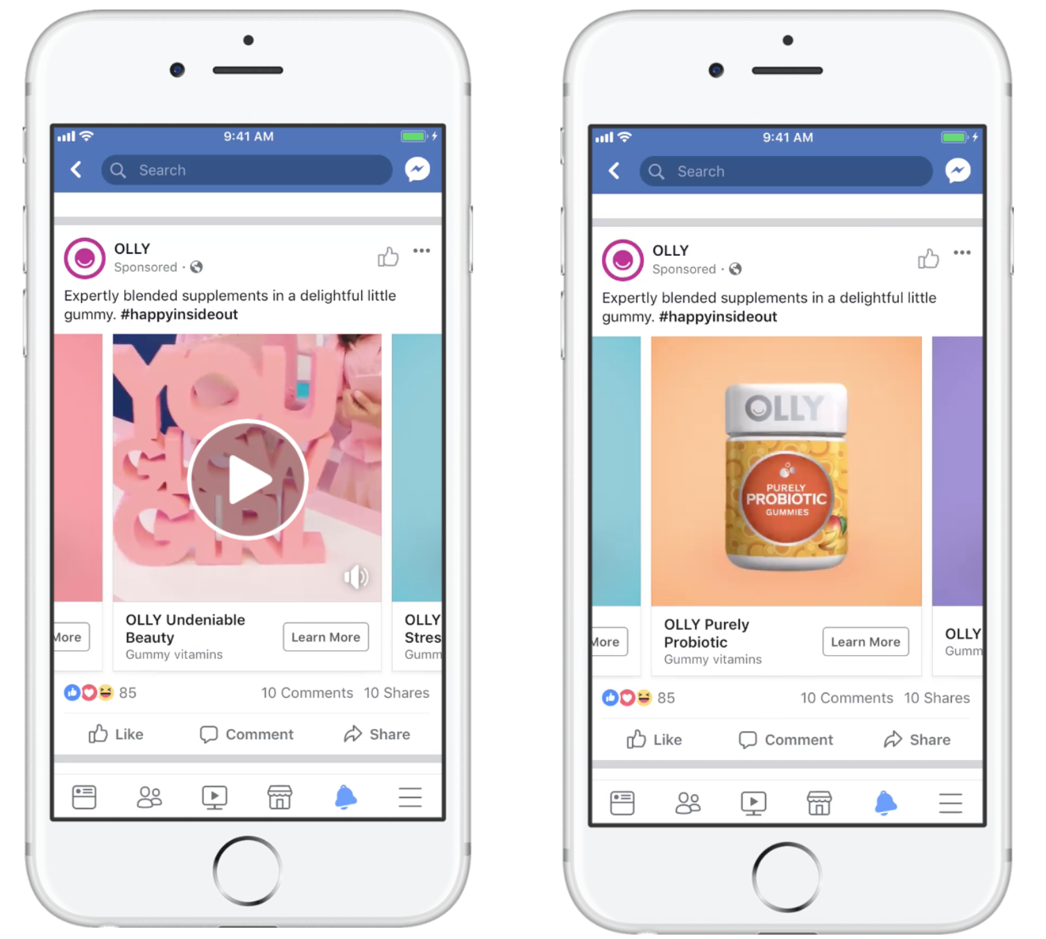
With a carousel like Olly’s, you can keep viewer attention longer and thus make your brand more memorable.
Send a consistent visual message
Last but not least, when setting up a campaign across Facebook and Instagram, you should use the same basic designs. Consistent design will make your brand recognizable, increase your brand awareness, and boost campaign results.
People take in visual information more easily than they do text or sound. Your visual choice, whether it’s a set of brand colors, a typeface, or an overall video template, will affect the way people encounter your brand for the first time or the fifteenth. Using the same design principles will jog people’s memory and help them understand instantly what your brand is about.
Many of Rareform‘s Facebook ads are variations on the same video template.
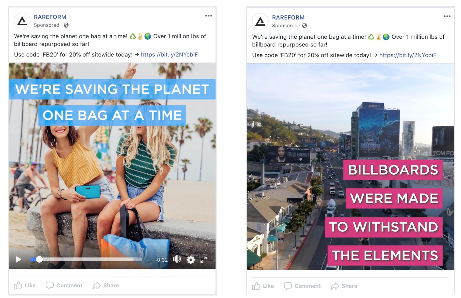
Once you’ve created a few ads in the same style, your target audience will start to consider your message more, since they’ll already know who you are and what you’re selling.
Design Your Way into Customer Hearts and Minds
Delivering a quality ad in the news feed will get you one step closer to winning the hearts and minds of your customers. With so much content to scroll through, a mobile-optimized ad that looks beautiful and is easy to understand will be a sight for sore eyes. By following these best practices, you can create content that’s valuable to Facebook and Instagram users, and good for business. And if you’re looking for some video inspiration, why not start with a template created with these principles in mind? Check out the Shakr library to find the perfect template for your video ad.



2 comments On News Feed Video Best Practices
Pingback: News Feed Video Best Practices | Local Business Hero ()
Pingback: News Feed Video Best Practices - TRENDING STORY ()
Comments are closed.