
That’s a direct quote from Shakr CEO, David Lee. It’s been a long couple of weeks as we’ve prepared to push a huge number of UX and UI improvements to make it easier for you to make a great video with Shakr.
The change you’ll notice first is to our homepage, where we’ve re-categorized all of our video styles to make it easier to browse through styles that are relevant to you. We’ll continue to tweak this over the next few days, as we see how our customers navigate the site.
The video creation process is where we’ve really tightened the bolts.
You’ll notice one change immediately. This screen is gone:
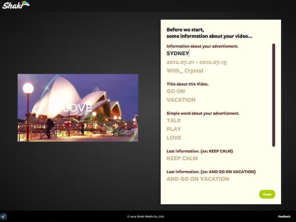
In the past, we asked you to enter all the text for your video up front. This didn’t make a lot of sense, because it was hard to know where the text would end up, in context. Now, you’ll be able to enter text throughout the creation process in the scene where it will appear.
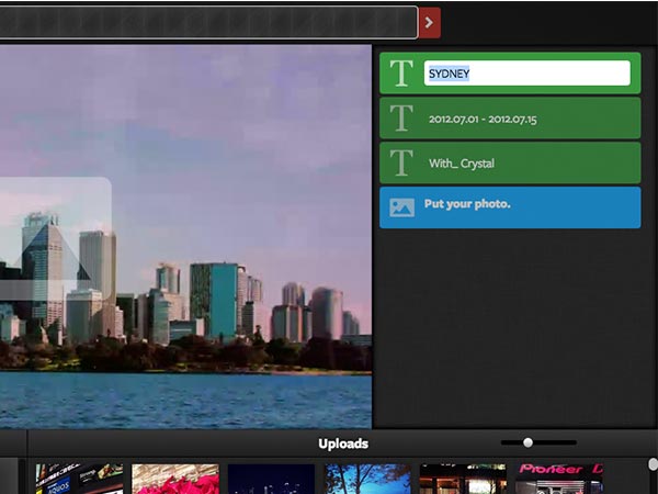
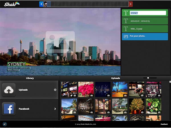
We also made the timeline at the top of the creator more useful. It used to just show progress, but now it’s fully clickable, so you can move back to a specific scene. The direction arrows are also now on either end of the timeline.
Finally, you also get to keep the photos and videos you upload to Shakr in your Uploads Library. Now, when you open the creator, recent photos or videos clips will be instantly accessible.
There are other small tweaks here and there. Perhaps the biggest thing you’ll notice, though, is that everything loads faster and runs more smoothly.
We hope you enjoy using Shakr for your video ads, personal videos and stories.