
Fun fact: Did you know that when you’re feeling sad or happy, it can actually affect how you process color?
Researchers have long known that your current mood can impact perceptions of space and color– even if it’s only very, very subtly. It’s why people who feel depressed describe their moods as “grey” or “feeling blue,” while those who are happy are more likely to use terms like “bright.”
There’s also evidence that color, in turn, can affect our mood and potentially even our decision making processes. And if something affects our decision making processes, it can affect buying decision processes.
While the influence may be subtle, the use of psychology of color in marketing is a real thing, and why not give yourself an edge however possible? In this post we’re going to take a look at how you can use psychology of color in marketing, particularly in your video ads, in order to them your campaigns as effective as possible.
Psychology of Color: Is it a Real Thing?
Color can theoretically affect someone’s perception of a brand, marketing video, or other images. Research shows that these affects may be subtle, and the research itself is so controversial, but there is some evidence that this is a real phenomenon no matter how slight.
This is partially rooted in societal associations and basic psychology.
Red, for example, is associated with power, energy, and anger. Think of the wide range of associations that you have with the color red. Some women see red lipstick as powerful; someone with a red face would immediately recognized as angry (if not overheated).
Color in psychology is subjective, and it can be based on personal history, cultural influences, and even personal preference. That being said, it’s likely that you have a similar cultural background with your audience, so you’ll be able to best understand how they’ll interpret it. For our data in this post, we’re going to look at color psychology commonly associated with Western countries, particularly the US and Western Europe.
Color Psychology Theories You Can Apply to Your Video Marketing
Though color psychology may not be as overtly influential as the music or text used in your videos, it can make a subtle impact, so why not use every resource at your disposal to improve your campaigns’ success?
Let’s take a look at a few color psychology fast facts to keep in mind for your next video campaigns.
Orange is An Overwhelmingly Unpopular Color
Orange is disliked by men and women overall, with more than 1/5 of men and 1/3 of women having selected it as their least favorite color. That’s significant, so you’ll want to be careful about using it for a predominant branding color or as a main background color for your videos.
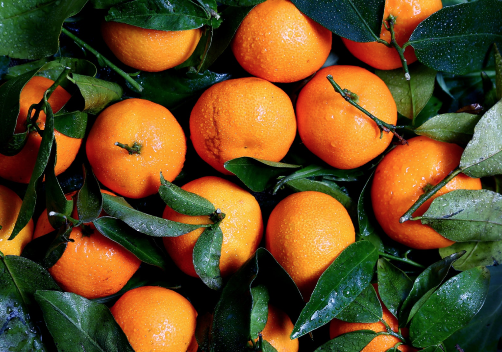
This is a very specific fast fact, but it’s one that should keep in mind. Why bother creating content that looks visually unappealing to so many members of your target audience?
The one good place to use orange: as a contrasting-color border or text to highlight your CTA at the end of your videos. An example of this can be seen in our Sweet Home video template, though the text is yellow instead of orange here:

The More Vibrant, The More Emotion
This makes sense. The more vibrant the color, the more evocative it will be, and the better the emotional effect it will have.
Which of the following two colors feels “happiest” to you?
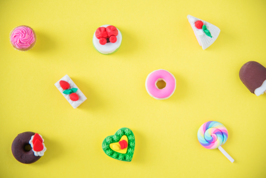
The one on the left feels more vibrant, partially thanks to the bright product colors in the background. It’s a sunnier yellow instead of a duller orangish shade, and it feels a little lighter and a little happier.
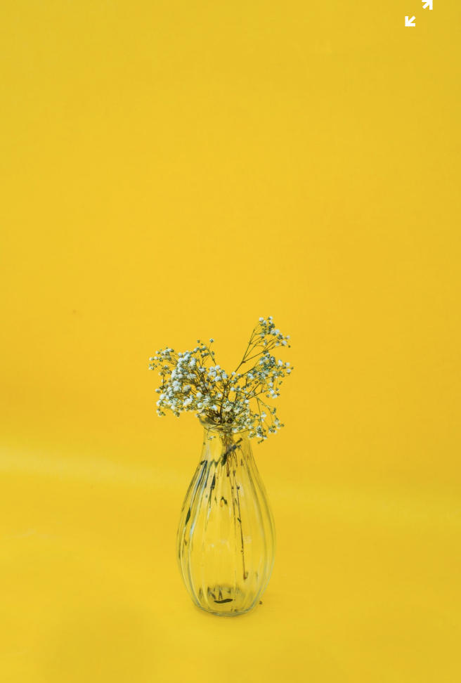
Want to make your video feel just a little more vibrant? Contrasting colors can help. In the image below, for example, a single pop of blue makes the rest of the image much more eye-catching, even though it was a nice bright magenta to begin with. The light blue makes it feel more vibrant, increasing the power (and potential emotional impact) of the image.
Shade Matters
A bright, delicate light blue background can come across as sunny, especially with yellow or white text within the video. Meanwhile, a dark grayish-blue can present a more somber tone that’s more associated with the phrase “feeling blue.”
Context Matters Even More
Color scheme and context matters a lot in how we respond to certain colors. Color cues, after all, can change depending on the context.
Let’s look at red again. It can symbolize passion, anger, aggression, energy, or power. That’s a lot of different very commonly associated meanings with a single color.
Red seen around Valentine’s Day will be most closely associated with passion, especially when white text is used or hearts are present.

Consider that it’s also used in negative political smear campaigns, where the red is meant to have a negative connotation.
In both cases, these cues with be subconscious. Despite this, they still play effective on common (and contrasting) associations in order to deliver that powerful effect.
Final Thoughts
Color isn’t the only thing that will affect the mood and emotion behind your video. Music, font type, and the actual images all play just as an important role. That being said, when you use all of these factors together to go after one effect, you can give an otherwise typical video the power punch it needs to get more conversions.
Ready to use this newfound knowledge to make stronger-performing video ads? Take a look at Shakr’s video templates to find the perfect framework for your next masterpiece.


2 comments On The Psychology of Color in Marketing & What It Means for Your Video Ads
Pingback: The Psychology of Color in Marketing & What It Means for Your Video Ads – Next Level Digital Marketing ()
Pingback: The Psychology of Color in Marketing & What It Means for Your Video Ads – Just Internet Marketing ()
Comments are closed.